An Autonomous Vehicle Experience
The autonomous vehicle experience reimagined into something much more intuitive and personally customizable for its users.
Role
User Research
Interaction Design
Visual Design
Wireframing & Prototyping
Tools
Adobe After Effects
Figma
Duration
Aug 2021 - Oct 2021
About
The goal of the project was to help reshape the way drivers experience fully self-autonomous cars. The future of this vehicle is now and it’s important to rethink of all the possibilities of things we could achieve if our car could fully drive on its own.
As UX/UI designers, it is important to help create a more intuitive experience for drivers who are new to the autonomous vehicle experience, as well as help enhance the experience of those who already own a vehicle that can operate on autopilot. Driving should be a safe space and a way for drivers to do more than unwind, given how much time we spend in our cars getting from point A to point B.
The Challenge
“How can we elevate the experience in an autonomous vehicle and what are ways we can extend its capabilities?”

Competitive Analysis
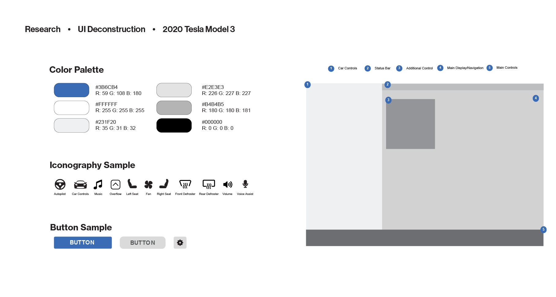
In order to design the most user-friendly interface for our new autonomous vehicle experience, the first step was to dissect existing user interfaces out there and figure out what worked and what didn’t. I took the initiative to go to two different car dealerships (Audi and Tesla) to explore the electric vehicles they offered that had state-of-the-art interfaces as its dashboard.
An evaluation that I found common across the board were typography that were too small to read, too many things showing on the screen at once, and the interfaces weren’t as intuitive for first time users. Some iconography didn’t include a description as to what its purpose is for, leaving room to create confusion. The screens weren’t dynamic or customizable, which is an important feature that should be implemented in technology today to make the experience special for each individual. Overall, the experience was not only overwhelming and a potential hazard to its driver, it took a lot of time to understand the car to its fullest capabilities when some things could’ve been made much more intuitive.


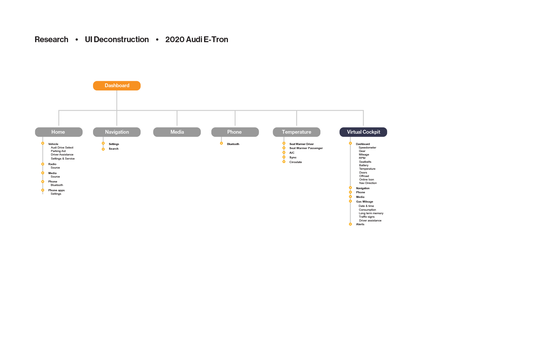
Audi Deconstruction
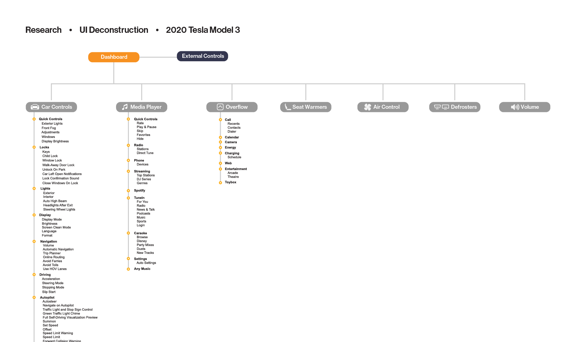
Tesla Decnstruction
User Research
The next step was to dive deeper and further understand our target audience. The big question poses, “What would our target audience want out of a fully self-autonomous vehicle?” Based on my newly found understanding of electric vehicle user interfaces, I developed a user survey and sent it out to 50 random participants.

Survey Insights
These were a few findings I felt were important to highlight and made the biggest contributions to design decisions in my interface.

After the surveys, the primary insights I was able to gather was the importance of navigation to users, as well as being able to form a trust between the new self-driving functions and its user. Given the opportunity to try such a vehicle, the user would love to be able to get things done during their drive, to help lessen their to-do list throughout their day. But what they prioritized above all, was being able to trust that their vehicle would get them to their destination safely. After the round of surveys, it was time to get started on empathy mapping and creating the user persona.

Empathy Map

User Persona
Constructing the Interface
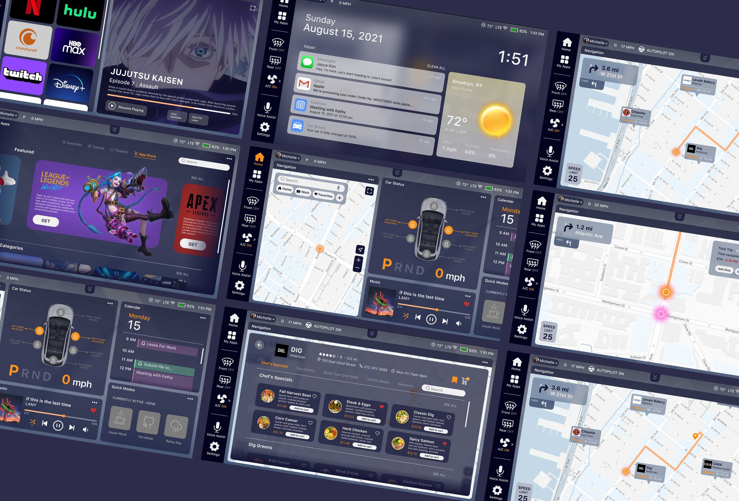
After the conducted research and finding the target audience based on the survey results, it is finally time to start implementing my sketches and turning the ideation into reality. The final user interface included a scrollable screen on the dashboard, so the user could have more freedom to display widgets as they saw most important to them and wasn’t confined to a small screen. Dashboards are customizable to personalize the drivers’ experience to make them unique to each individual. The interface by default is in a dark mode as it is the overpoweringly preferred theme to use although the user does have options to switch back and forth which is also much more adaptable to day and nighttime refractions through the windows.


Initial Sketches
Before doing any high-fidelity wireframes, I threw out all my ideas into sketches — looking for the best solution. I focused on displaying navigation and ways to make offer as much optimal features as possible; based on the customer research.


Final Reiteration

The Final Solution
After the many reiterations of sketches, wireframes and tossed explorations—we can finally bring the final interface to life. I prototyped with Figma to see how users would interact with our autonomous vehicle dashboard.
Here are some of the core features.

Scrollable Dashboard
The best solution wasn’t to confine all the widgets to the frame of the screen. It was to expand on the possibilities that could be achieved with a unique, modular and dynamic grid display. The user can now be in the driver’s seat (no pun intended) to personalize their interface experience that’s most unique and applicable to them.

Sync Route
By syncing a route to your destination with your friend, their car will be able to follow behind you on autopilot with real-time traffic updates and any route changes. You will be able to see your friend’s location marker on the map, and you will be able to get to your destination simultaneously.

Quick Modes
Quick modes will save a profile’s route destination complete with temperature settings, music playlists, speed limit and other driving preference. This will save a profile’s preferred settings for every mood or routine without having to set them each time.
What I Learned
One of the most important takeaways was that I learned how to embrace ambiguity. While the technology in the autonomous vehicle industry is constantly evolving, I had to find a way to market my solution in ways that it can stand above its competition. I had to learn not only how to elevate the experience of what’s already in place but also pitch innovative ideas that hasn’t been explored yet. But it was also important I knew how to balance the ideas with technical feasibility.
Another important takeaway I learned from this project was how to break this seemingly intimidating problem into smaller, digestible parts. When I broke down the design process and tackled each part one by one, it was much easier to define each hurdle and figure out how to solve it.
Overall, this project has taught me a lot about how to design for a new type of technology that is very important we know how to navigate and it was not only a big learning experience for me; it was also a really fun journey to be a part of. I hope to revisit this project in the future and start implementing ways this interface can cater to accessibility as well.